Bar graphs serve as a cornerstone in the visual analysis of data within the realm of research. They offer a straightforward yet powerful means to compare and contrast quantities across various groups or time frames. Bar graphs are used for a visual representation in research to compare data across different categories or periods through rectangular bars. The length or height of each bar correlates with the exact values it represents, making it an effective tool for showcasing trends in a clear manner. This article will provide a complete guide on how to describe a bar graph in research, ensuring that researchers can effectively communicate their data to a diverse audience.
The main points to be covered include:
- An introduction to what a bar graph is, its structure, types, highlighting how they are constructed and the various formats they can take.
- Strategies for effectively describing the data shown in bar graphs, focusing on clarity, accuracy, and relevance.
- The importance of using precise language and statistical terminology when discussing bar graph data.
- Tips for interpreting bar charts, including common pitfalls to avoid and how to draw insights from visual data.
As we move to the detailed discussion, we’ll explore these aspects in depth, equipping researchers with the necessary tools to present their bar graph data confidently and competently.
Understanding the Concept of Bar Graphs
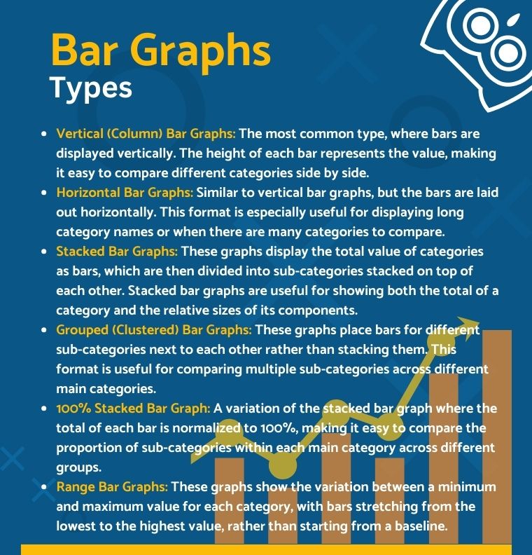
A bar graph, also known as a bar chart, is a visual tool used to represent data graphically. It consists of rectangular bars, which can be aligned either vertically or horizontally, showcasing the comparison among categories. The vertical bar chart is one common type, where bars stand up from the horizontal bar graph, making it easy to compare different values. On the other hand, a bar chart can also be a horizontal bar chart, laying out the bars from left to right, which is particularly useful for displaying long category labels.
Besides these, there are other types of bar charts, like the stacked bar chart and the grouped bar chart. A stacked one puts bars on top of each other to show more than one group of data on a single bar. A grouped bar chart, on the other hand, puts bars next to each other to make it easier to compare different categories across groups.
How to Describe a Bar Graph in Research
In study, to describe a bar graph, you need to look at its parts and the data they show in a clear and detailed way. First, identify key features, like the title, the axis names, and the bars themselves. Make sure you talk about all the data that was given and point out any important trends, comparisons, or patterns that were seen. This process not only gives a good overview of what the graph shows, but it also prepares the way for a more in-depth look, which helps people understand the study results better.
Start with the Title
The title of a bar graph serves as a concise summary of what the data represents. It sets the context for the graph’s content, indicating the specific topic or variables being explored. A well-chosen title helps readers understand the scope and purpose of the data analysis, highlighting the relationship between the variables at a glance. Therefore, the title is not just a label but a fundamental element that frames the entire graphical presentation.
Examine the Axes
In a bar graph, each axis plays a vital role in data representation. The horizontal axis, or x-axis, typically displays the categories or groups being compared, while the vertical axis, or y-axis, outlines the scale of values or measurements associated with these categories. It’s essential to note the variables and units of measurement specified along these axes. The vertical axis (y-axis) often represents the quantitative data, showing how values vary across different categories listed on the horizontal axis. Accurately understanding these axes is key to interpreting the graph’s data correctly.
Highlight Key Trends
When looking at a bar graph, finding and explaining the main trends is essential. Look for trends in the data, like growth, decrease, or stability. A trend of growth could be shown by a set of bars that get taller over time, showing that the data being shown is going up. Conversely, a declining trend would be visible through bars that progressively decrease in size. Stability is also seen when the bars stay the same size, which means they don’t change much over time.
Discuss Specific Data Points
Discussing data issues, especially peaks, troughs, and anomalies, is crucial when analyzing a bar graph. Peaks represent high points in the data, often indicating a significant increase or maximum value in a certain category. Troughs, or low points, highlight areas of minimum value or decrease. Anomalies are data points that deviate from the expected pattern, raising questions or suggesting areas for further investigation. These elements should be clearly identified, potentially on a labelled horizontal x-axis for clarity. Additionally, error bars and stacked bars can provide insights into data variability or comparative subgroup analysis within a single category.
Compare and Contrast
In comparing and contrasting data within a bar graph, focus on how individual data points relate to one another across different bars. This analysis can reveal significant differences or similarities that the graph represents. For instance, comparing the heights or lengths of bars can highlight which categories outperform or lag others, indicating trends or disparities in the data. Such a comparison not only elucidates the relative performance of each category but also underscores the overall narrative the graph aims to convey, offering a comprehensive understanding of the depicted information.
Contextual Analysis
To do a contextual analysis of a bar graph, we need to talk about how the graph shows the data in relation to the broader context or the underlying research question. In this case, you have to think about more than just the numbers on the graph. Consulting a complete guide to statistical analysis can help you better understand what the data trends and patterns mean in the bigger picture of the study. Such an analysis helps in drawing meaningful conclusions, identifying potential causes or effects, and suggesting how these insights can inform future research, policy decisions, or practical applications.
Share with Your Findings
Sharing your findings involves succinctly summarizing the insights gleaned from the categorical data presented in the bar graph. This step is crucial in data visualization, as it transforms raw data into understandable narratives. Highlight the key trends, patterns, and anomalies identified, emphasizing their relevance to the research question or objective. Through proficiently conveying these observations, you validate the worth of your investigation and guarantee that your audience comprehends the importance of the data visualization, thereby cultivating a more profound comprehension of the topic at hand.

Descriptive Language for Bar Graphs
Descriptive language for bar graphs enriches the presentation and interpretation of statistical and numerical data. Key vocabulary includes terms like “increase,” “decrease,” “peak,” “trough,” and “stable,” which precisely describe the movements and trends within the graph. Each bar corresponds to a specific category or time, allowing for a clear statistical data representation.
Start your talk with something interesting that will grab their attention right away. Try different versions of:
- Take a moment to consider this bar graph…
- I invite you to examine this diagram with me…
- Please direct your attention to this map…
- Observing this graph reveals…
- Exploring this pie chart, we can see…
- A closer look at this line graph reveals…
- To underscore my argument, let’s delve into these pie charts…
Comparative adjectives, such as “greater,” “less,” and “comparable,” are instrumental in highlighting differences or similarities between categories. For instance, one might say, “The bar for 2021 shows a greater increase in sales compared to 2020.” Superlative adjectives like “highest,” “lowest,” and “most significant” pinpoint the extremes within the data, essential for emphasizing key findings. For example, “The highest bar represents the peak sales period.”
Based on these reflections, your choice of tense will vary:
- For Past Data: Use the past simple to describe completed actions or trends. Example: “This bar chart outlined how market trends evolved from 2010 to 2020.“
- For Present Data: The present perfect suits data showing ongoing trends up to the current moment. Example: “This diagram has demonstrated a steady increase in user engagement over the past year.“
- For Future Projections: The future simple is best for predictions or expected trends. Example: “This projection suggests that renewable energy adoption will surge by 2030.“
The adept use of this descriptive language makes the data more accessible and adds a narrative layer to the numerical information, engaging the reader. For those seeking to improve their ability in presenting data, especially in academic contexts like statistics homework done, understanding how to apply these linguistic tools is key. It helps in sharing findings with precision and in a manner that resonates with the audience, ensuring the statistical data’s significance is fully appreciated.

Common Mistakes to Avoid
When presenting data through bar graphs, certain common mistakes can significantly detract from the accuracy and clarity of your analysis. Being mindful of these pitfalls can enhance the effectiveness of your data representation.
One key oversight is neglecting small but significant details, such as ensuring bars have an equal width, which can affect the visual impact and interpretation of the data. Each bar’s width should uniformly represent the category it signifies, avoiding any misrepresentation of the measured value.
Misinterpreting the scale or units of measurement is another common error. It’s crucial to clearly understand and convey the scale used, especially when dealing with discrete values. The scale influences how the audience perceives the magnitude of differences between categories, and confusion here can lead to misinterpretation of the data’s significance.
Additionally, ignoring the overall context of the data can lead to a skewed understanding of what the graph represent. Understanding the types of bar used (e.g., standard, stacked, or segmented) and the significance of line segments connecting bars can provide deeper insights into the data trends and relationships.
To avoid these and other pitfalls, consider leveraging resources available at academic support sites like PapersOwl.com, which can offer guidance and tools for crafting clear, accurate, and impactful data presentations.
Example of Describing Bar Graph in Research
The provided one bar graph offers an insightful glimpse into the gender distribution of engineering students at Australian universities over three key years: 1992, 2002, and 2012. This column chart presents data that is drawn vertically, with each column’s height corresponding to the number of different groups of students. The visual form on one axis offers insights into categorical variables — gender and enrollment numbers — and the orange bar signifies the number of women, marking a consistent upward trajectory. The comparison between the bars of each corresponding year highlights that, despite the overall growth in female enrollment, there remains a consistent gender gap.
In 1992, the bar graph shows a significant gender disparity with the blue bar towering around the 14,000 mark, in stark contrast to the modest orange bar represents at 2,000 the number of female students. By 2002, the blue bar exhibits a slight decline to 12,000, suggesting a decrease in male students, while the other bar shows a notable increase, signalling a rise in female enrollments. The 2012 data maintains the blue bar’s level, suggesting stabilization in male student numbers, but the orange one continues its upward trend, doubling the 1992 figure for female students, although still not equaling the male representation.
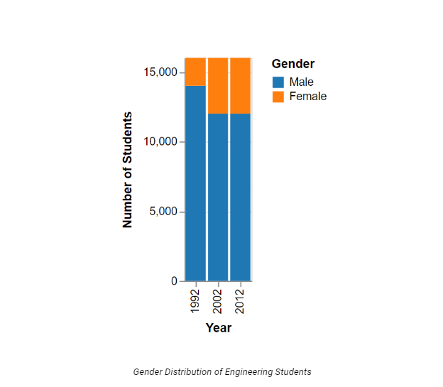
The graph’s other axis scale categorically differentiates the years, displaying the temporal changes. Notably, no horizontal bars or line graphs are present, focusing the viewer’s attention solely on the comparative heights of the vertical bars.
Such data visualizations aren’t just for school; they can be used in the real world to tell a story using statistics that could lead to new study project ideas. People searching for new statistics project ideas could look into how changes in society, education, or policy could affect these gender trends in STEM areas. Platforms are full of resources and ideas for this kind of work.
Putting Together Insights
So, the ability to describe a bar graph effectively hinges on attention to detail and an understanding of its components, such as axis labels and class intervals. The importance of describing each bar graph element, from nominal variables to the significance of each bar’s height or length, cannot be overstated. It is this precision and clarity that empower readers to swiftly interpret the data and extract meaningful insights. Whether one is dealing with a single bar graph or multiple comparative datasets, the same principles apply: clear articulation of trends, vigilant consideration of context, and careful correlation of graphical representation with the underlying research narrative. Mastery of these skills is not just academic; it is a critical communication tool that transcends disciplines and informs decision-making processes in numerous fields.